Top Home Color Trends For 2022
Neutral Tones
Neutral earth tones are all in for 2022. The pandemic has given us this desire to feel more grounded and connected to nature in our daily lives. Bringing soft nature inspired tones of browns, whites, greens and blues into your home is a great way to make yourself and your home feel more centered.
Shades of Brown
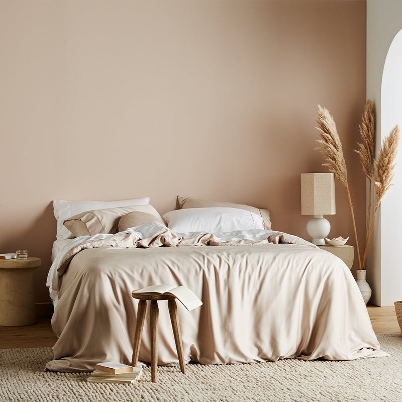
It's all about grounding earth tones. Brown is one of those colors that gets overlooked sometimes. If applied correctly, it can make your home feel calm, cozy, stylish and well put together. A brown accent wall paired with textures like wooden tables, silk sheets and neutral colored artwork will tie the space together.
Shades of Blue
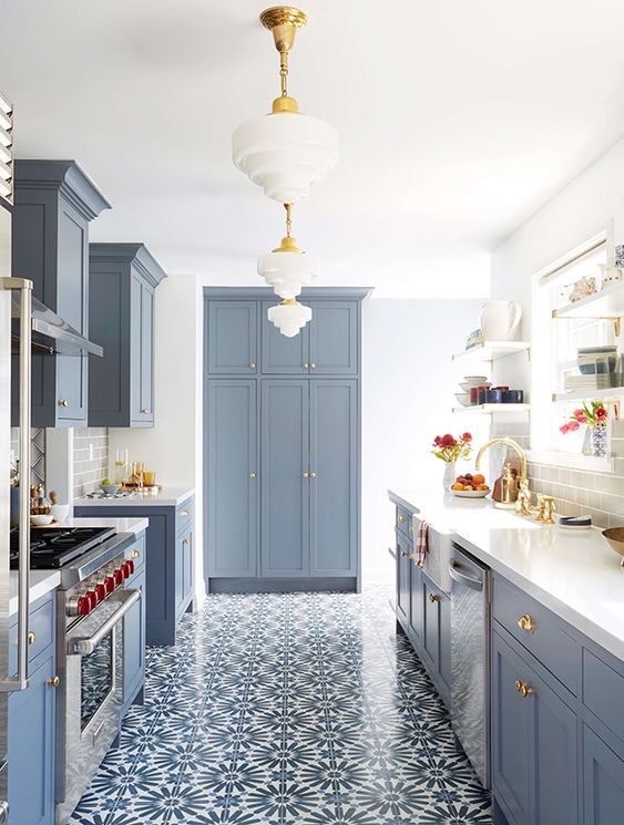
Who wouldn't want to feel like they've stepped into a bright summer's day in the comfort of their own home? Pops of earth-y blue can give your home that summer feeling all year long. Like a breath of fresh air, blue will give your space into a totally 'cool, calm and collected' energy - just what we need for 2022.
Shades of Earthy Green
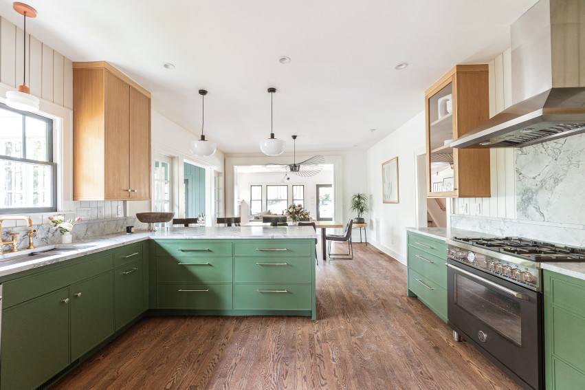
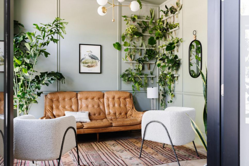
Again, colors reflecting nature are a big trend for 2022. The color green is associated as a color reflecting nature, revitalization, growth and fresh starts. It is a great way to bring a bit of color into your home, while still keeping things neutral. This color pairs well with white, light wood tones, light browns, gold accents and of course house plants!
This exact wall color is: Sherwin Williams Evergreen Fog
Bold Brights
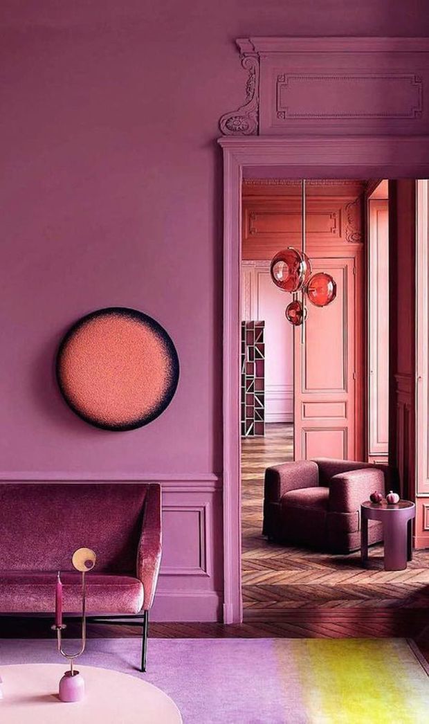
Unlike the subtle earth tones mentioned above, nothing says "I'm optimistic and happy to be here" quite like a purple and pink monochromic color scheme... Bright colors are such a great way to bring personality, warmth and happiness into your home. Now, this colorful Paris apartment is bold. If you're into color, but don't want to go full monochrome, an accent wall or subtle pop of color would be perfect for you. Check out or blog post on Ways To Add Personality To Your Home for some color application inspiration!
"Veri Peri, Pantone's 2022 color of the year is a vibrant shade of periwinkle that blends the soothing familiarity of blue with the energy and excitement of red. Designed to pique curiosity and creativity, the warm, joyful hue is meant to symbolize our transition out of the isolation of the COVID-19 pandemic." - Better Homes & Gardens
